

Figma Library
IDKit Figma Library
Design components and templates for World ID integration
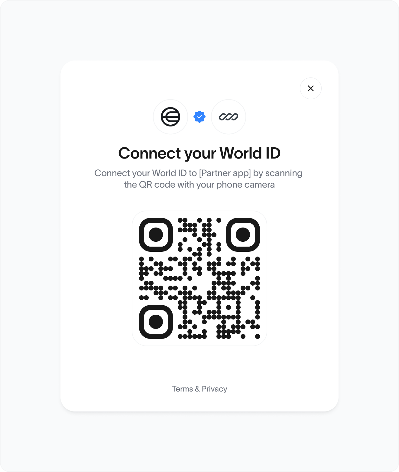
Core structure:
- World ID logo
- Partner logo (Optional)
- Title: “Connect your World ID”
- Description: “Scan the QR code to connect your World ID”
- QR code container (central and prominent)
- Footer: “Terms & Privacy” link
- Dismiss (X) icon for closing the modal or window
Customization Guidelines
✅ Partners may:- Adjust typography to match brand styles, keeping clear hierarchy (title > body)
- Modify corners or shadows to match their brand
- Modify colors, as long as contrast and accessibility are preserved
- Customize container shape (e.g., rounded corners) and shadow
- Add a light/dark mode toggle or theme-matching behavior
- Localize the copy if needed (preferably keeping semantic structure)
- Add their brand logo above the title
- Remove or replace the World ID logo
- Alter or obscure the QR code
- Change the copy in a way that misrepresents World ID
- Make the QR code too small
Size & Spacing
| Element | Recommendation |
|---|---|
| QR Code | Minimum 160 x 160px |
| Padding | Min. 24px all sides |
| Logo size | 32-48px width |
| Font (title) | Minimum 16px |
| Font (description) | Minimum 14px |
Accessibility checklist:
- Meet minimum QR code sizing for easy scanning
- Meet WCAG AA contrast for all text
- Make the modal keyboard-navigable and screen-reader friendly
- Make “Terms & Privacy” a focusable link
Behavior checklist
- Open the modal centered and dim the background
- Auto-refresh or invalidate the QR code after a set time (e.g., 5 mins)
- Optional callback/event on QR scan success
- Close the modal gracefully with the X button
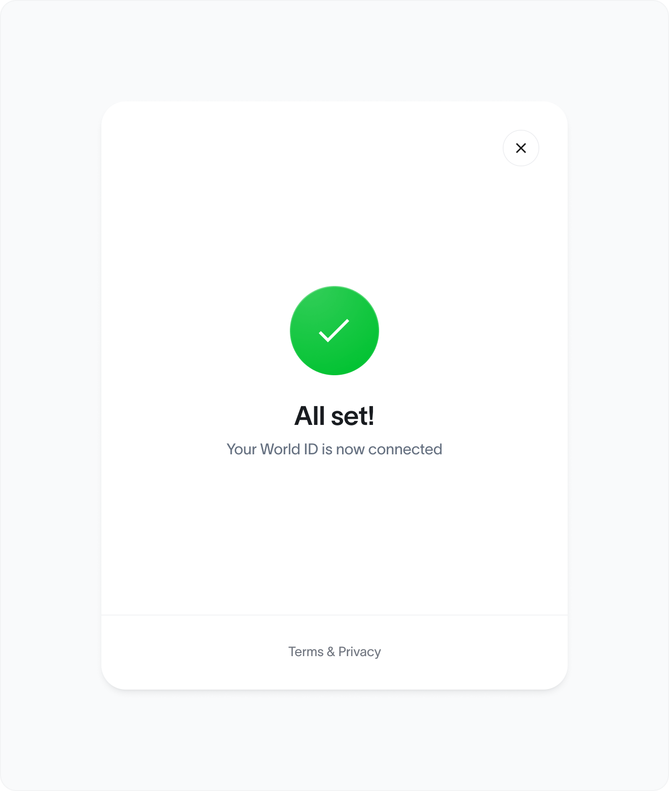
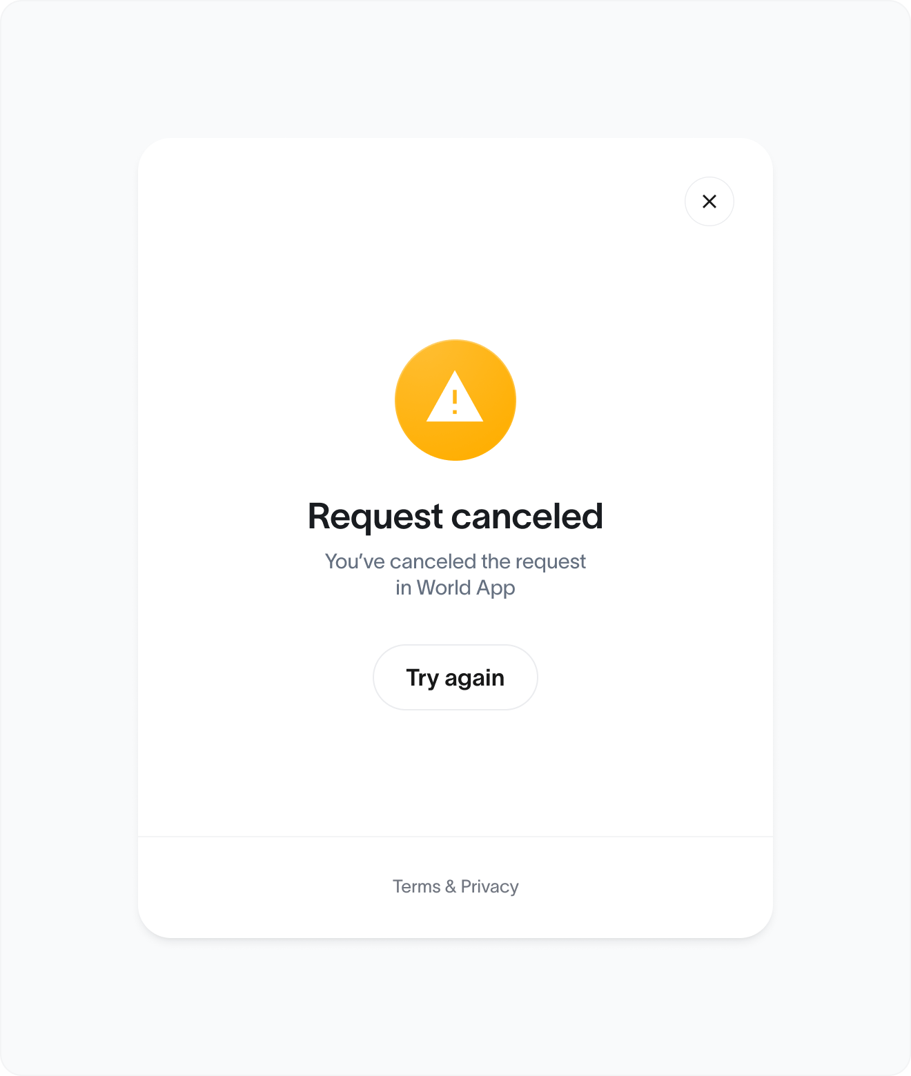
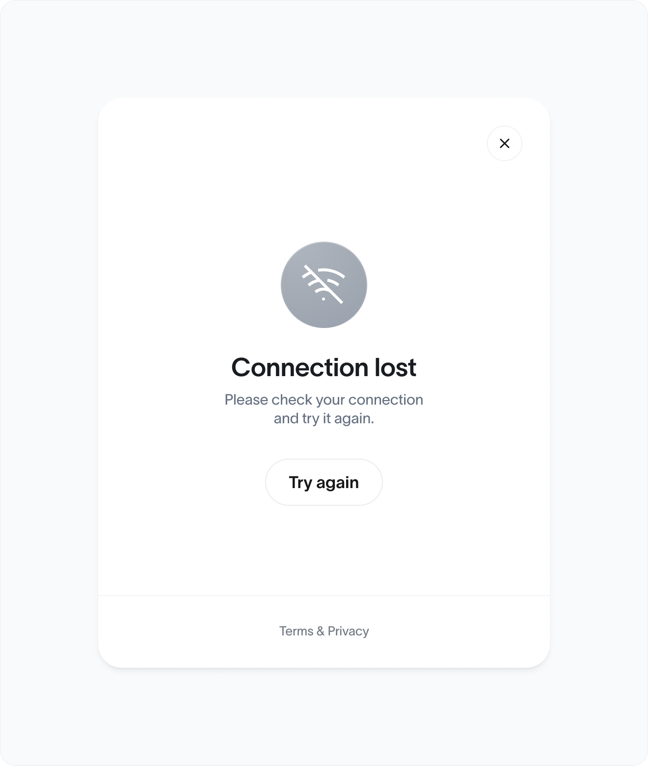
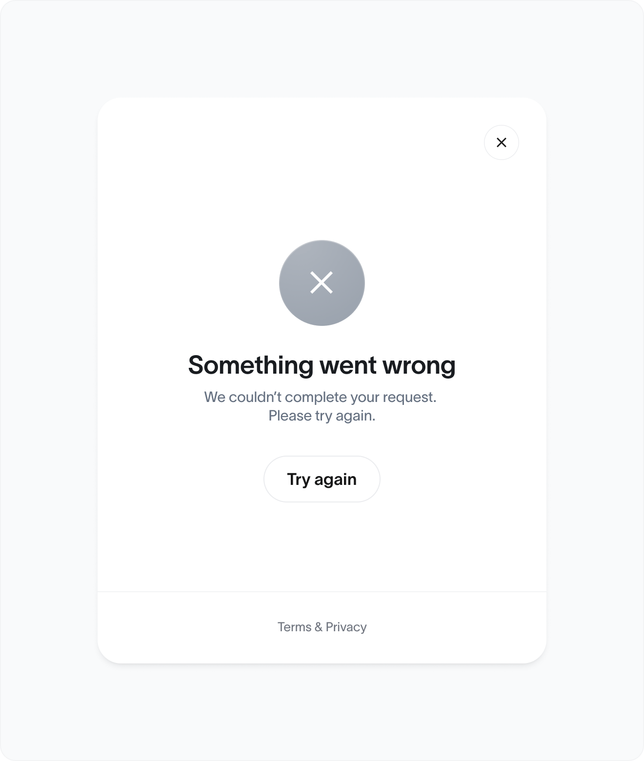
States
Default Waiting for user to scan the QR code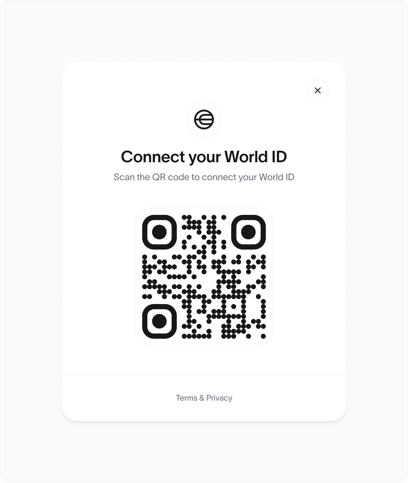
Partnership example
Verified Human Badge
The Human Badge signals that an account or user is verified as a unique human via World ID. It builds trust, improves authenticity, and embeds into products across industries (social, gaming, commerce, identity, etc.).
Badge design
- Symbol: World icon
- Label: human in lowercase, optionally styled in pill or badge form
Variants:
- Icon-only: for dense UI like leaderboards or tooltips
- Icon + label: preferred for public profiles, social posts, and player cards
Do:
- Keep badge small, clear, unobtrusive
- Always pair with or near a user identity (e.g. username, avatar)
- Use consistent shape and padding
Don’t:
- Overstyle or animate
- Replace or remix copy (“real human”, “verified user”, etc.)
- Add misleading hierarchy (e.g. badge > blue check)
Placement guidelines
| Content | Placement | Format |
|---|---|---|
| Social profiles | Below or beside username / bio | Icon + label |
| Gaming profiles | Under character name or stats | Icon + label |
| Leaderboards | Right of username | Icon + label |
| Messaging/chat | Right of username | Icon + label |
| Account dashboards | Near user ID, next to login method, etc. | Icon + label |
Theming & Branding
✅ Partners may:- Adapt badge color to suit light/dark mode
- Remove or replace the word human
- Make it look like a World ID badge gives higher permissions than intended
- Change the logo shape
Rules checklist
Layout and Visual
- Correct badge asset used
- Logo is not distorted, recolored or modified
- Minimum height is respected
Placement
- Placed directly next to or below user, display name, or avatar
- Badge is not visually grouped with unrelated badges
- Badge does not imply special privileges unless defined